
Color is not independent of the product
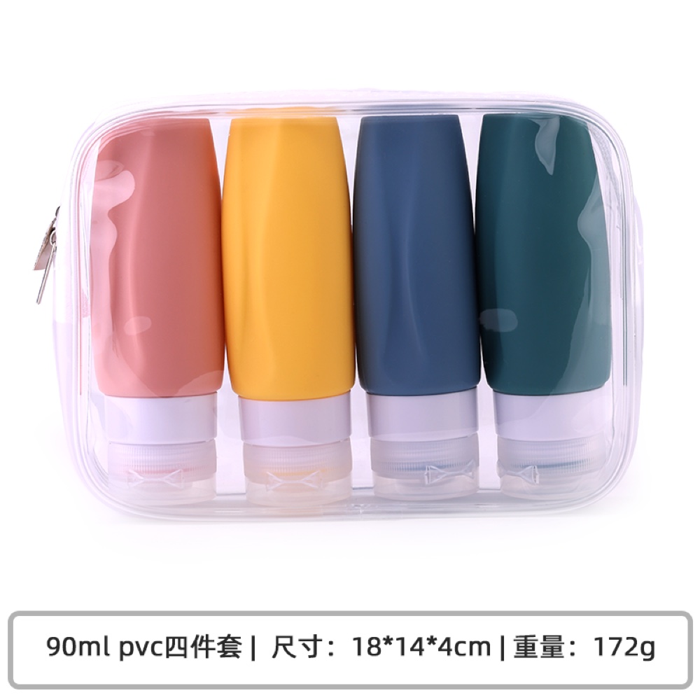
The same color direction can appear different on a flexible silicone bottle, a harder cap and a printed carton. Material, surface reflection and viewing background contribute to the result. With translucent parts, thickness and objects behind the material can affect the perceived color. Approving a flat plaque does not eliminate the need to check relevant locations on the finished product.
The International Commission on Illumination’s *Colorimetry*, fourth edition, CIE 015:2018, includes standard observers, illuminants and illuminating and viewing conditions. Comparable color assessment requires controlled conditions, rather than separate judgments made in unrelated rooms. CIE: Colorimetry, 4th Edition
Instrument manufacturer Shimadzu explains that, in transmission color measurement, changes in sample thickness alter spectral transmittance and therefore the measured color. A practical purchasing approach is to agree the physical reference, comparison location and viewing conditions before deciding whether instrument measurements are needed. Shimadzu: Color Measurement
Why do matching phone photographs not settle approval?
A photograph passes through lighting, exposure, white balance and screen display. It can communicate a direction or identify an inconsistent area, but should not carry final color approval alone. A brightened image can make a dark part appear lighter, while the surrounding background can influence visual judgment.
Start with an agreed physical reference under consistent lighting and background, and record the comparison location. If relevant, review the product in additional conditions representing retail display, bathroom use or ecommerce photography. These should inform approval in advance, rather than becoming new acceptance criteria after delivery.
For a multi-material set, define the design objective too. Should the body, cap and carton look as similar as practical, or form a deliberate tonal family? Giving every component the same color code does not answer that question.
A color-difference number needs a method
Numerical comparison helps only when both parties use the same formula and measurement conditions. ISO/CIE 11664-6:2022 defines the CIEDE2000 color-difference formula. It provides a calculation method, not an automatic acceptance limit for a particular Zhongding bottle. CIE: ISO/CIE 11664-6:2022
An instrumental approval record should identify the reference, measurement position, thickness or support conditions, settings, formula and agreed limit. Do not switch among curved, textured or differently thick areas merely to obtain a favorable number. Where direct measurement is unstable, discuss an appropriate combination of reference plaques and visual inspection of the finished part.
A single number does not describe the coordination of a whole set. Local gloss, texture and translucency also deserve attention. Keep physical references and records at the same revision for later batches, rather than approving one batch from photographs and another from objects.
Logo approval extends beyond putting the mark on the surface
First establish the decoration route. A raised or recessed mark formed in the mold and a subsequently applied surface decoration involve different processes and approval questions. The former requires consideration of depth, corners and tooling; the latter depends on the specific surface, decoration materials and use conditions. Suitability depends on the selected product and process.
Next consider location. An area that is frequently squeezed, bent or gripped experiences different use from a relatively stable area. Small lettering that looks clear in flat artwork can become difficult to read on a curved or textured surface. Assess actual-size artwork on the intended finished part, rather than relying on enlarged images.
Durability requirements also need context: which liquids contact the mark, how it is cleaned, whether it is repeatedly squeezed, and whether rubbing comes from hands or packaging. Agree evaluation methods around those conditions and inspect legibility, loss, transfer and surface change. “Permanent” or “never fades” is not a substitute for a defined assessment.
Illustrative scenario: one brand color looks like three unrelated ranges
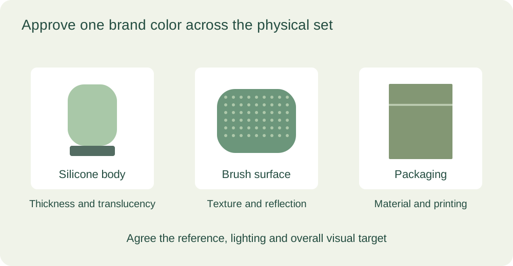
Consider a brand combining travel bottles, a manual cleansing brush and packaging into one personal-care kit. The artwork uses one green, but the bottle is slightly translucent, the brush reflects light differently and the carton creates a third appearance. This is a hypothetical branding scenario.
Asking each production stream to match a color code independently may yield components that look acceptable alone but uncoordinated together. Instead, agree the whole set’s visual objective and a primary reference, then define the comparison conditions for each material and location. The brand may choose close visual alignment or approve intentional tonal differences. That decision should be recorded before volume production.
Handle logo approval as a separate decision. Position the actual-size mark on the planned area, check readability over the surface and evaluate decoration through the intended squeezing and cleaning conditions. Passing color review does not establish decoration durability. Moving a logo can also require review of its new flexing and rubbing exposure.
This approach translates “does it look like one brand?” into a shared review of a complete physical set, rather than having each component pursue an isolated number.
What should buyers prepare for a Zhongding discussion?
Zhongding’s existing silicone travel bottle designs and cleansing brush structures provide starting points for color, branding and kit discussions. Bring physical color references, vector artwork, proposed positions, packaging layouts and the use environment. Include existing acceptance requirements where available.
The Zhongding team has years of silicone product manufacturing experience. In silicone OEM/ODM discussions, agreeing the finished effect and acceptance basis before selecting the applicable solution can reduce disagreements between approved artwork and received goods. Brand consistency rests on reviewable samples and records, rather than stronger promotional language.